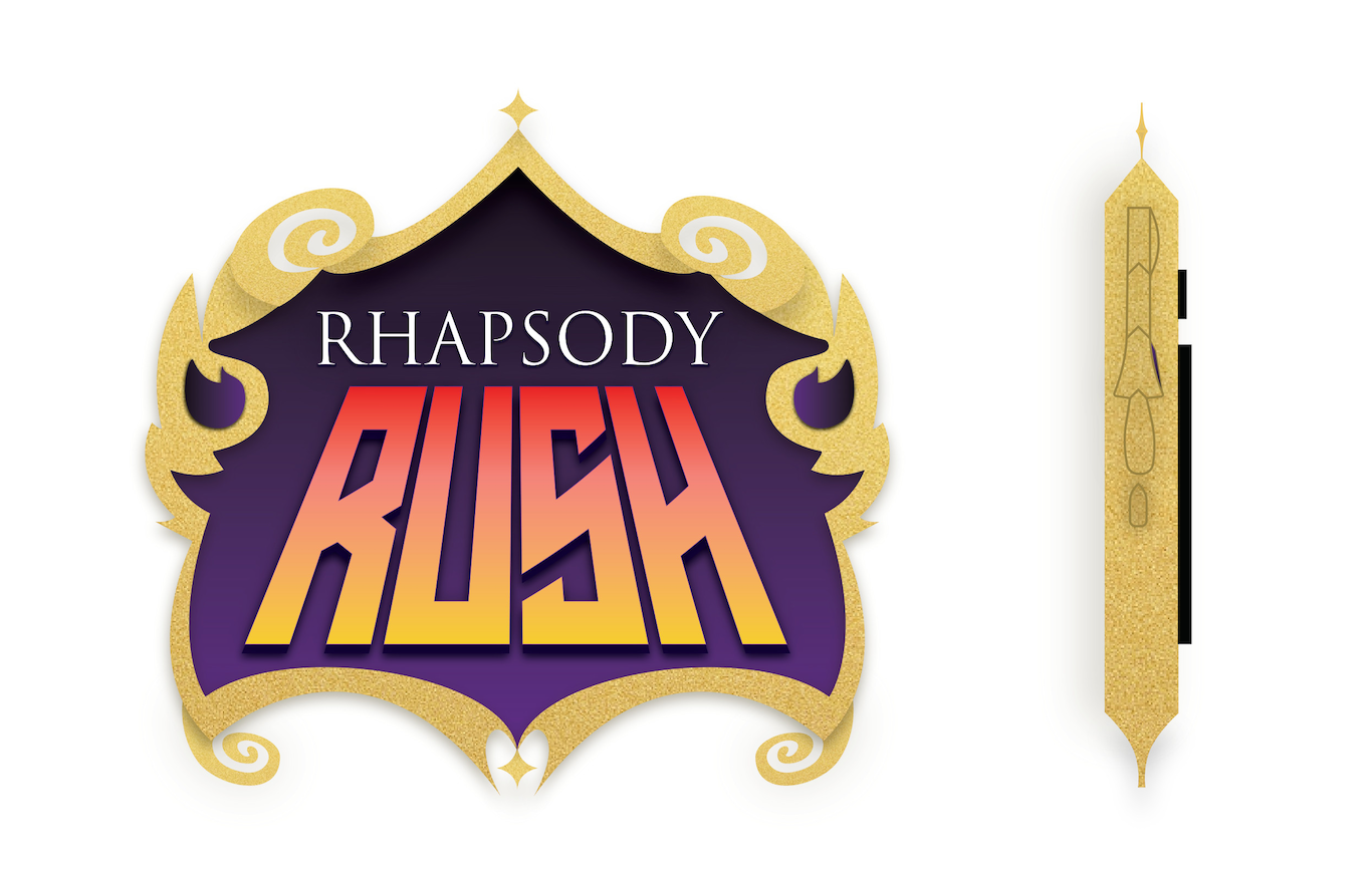

DESIGN A - FINAL VERSION
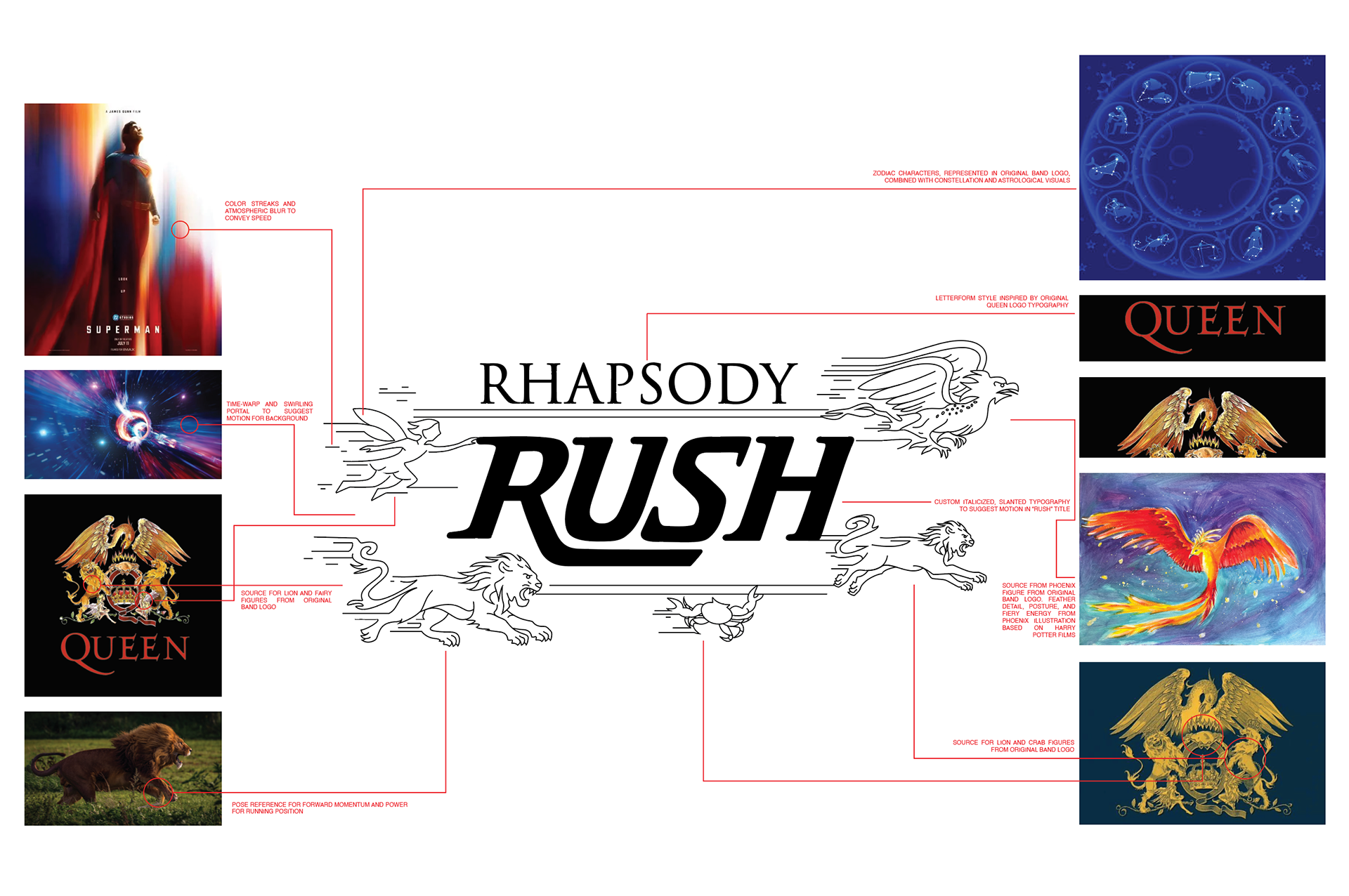
Design A became the final direction after pivoting from Design B (see below). I drew heavy inspiration from Queen's logo, specifically the characters representing each band member. I wanted this visual language to make it clear that the ride was about Queen. Because each character from the logo corresponds to a band member's zodiac sign, I decided to incorporate an astrology-inspired aesthetic. To match the high-energy, fantastical experience of the ride to Queen's music, I infused the design with a cosmic, galaxy-like feel. This approach helped create a marquee that felt more dynamic and unmistakably Queen.
FINAL SKETCH
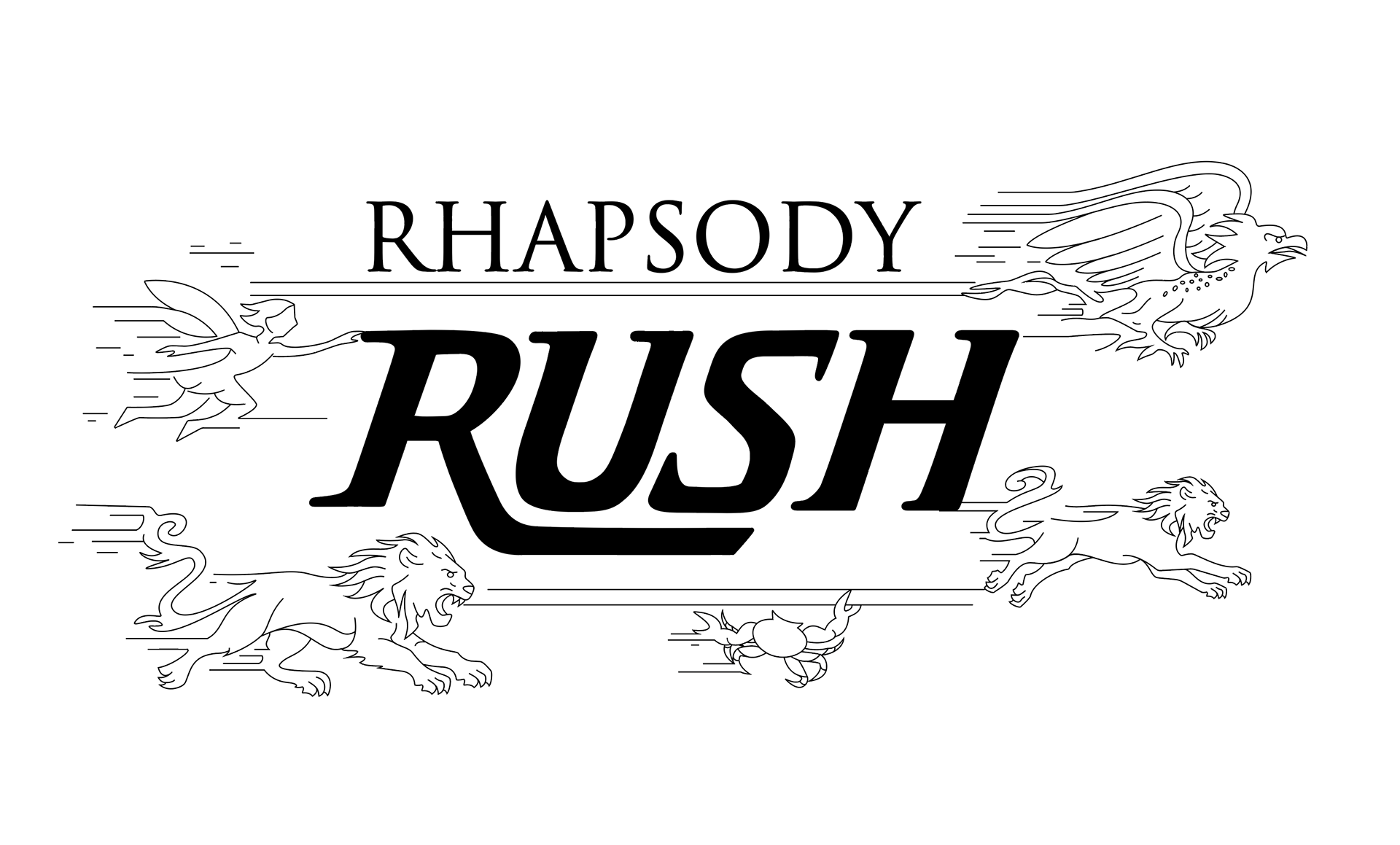
FINAL BLACK AND WHITE VECTOR
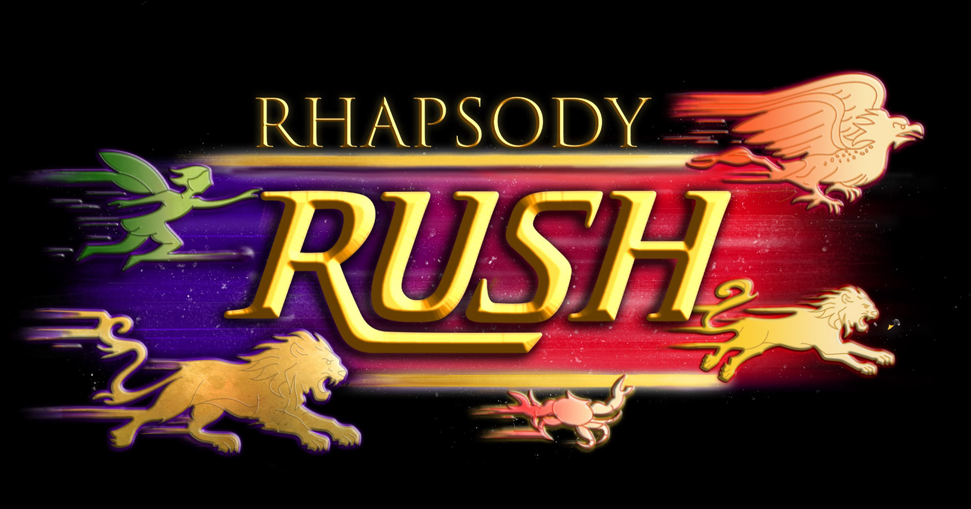

FINAL MARQUEE DESIGN
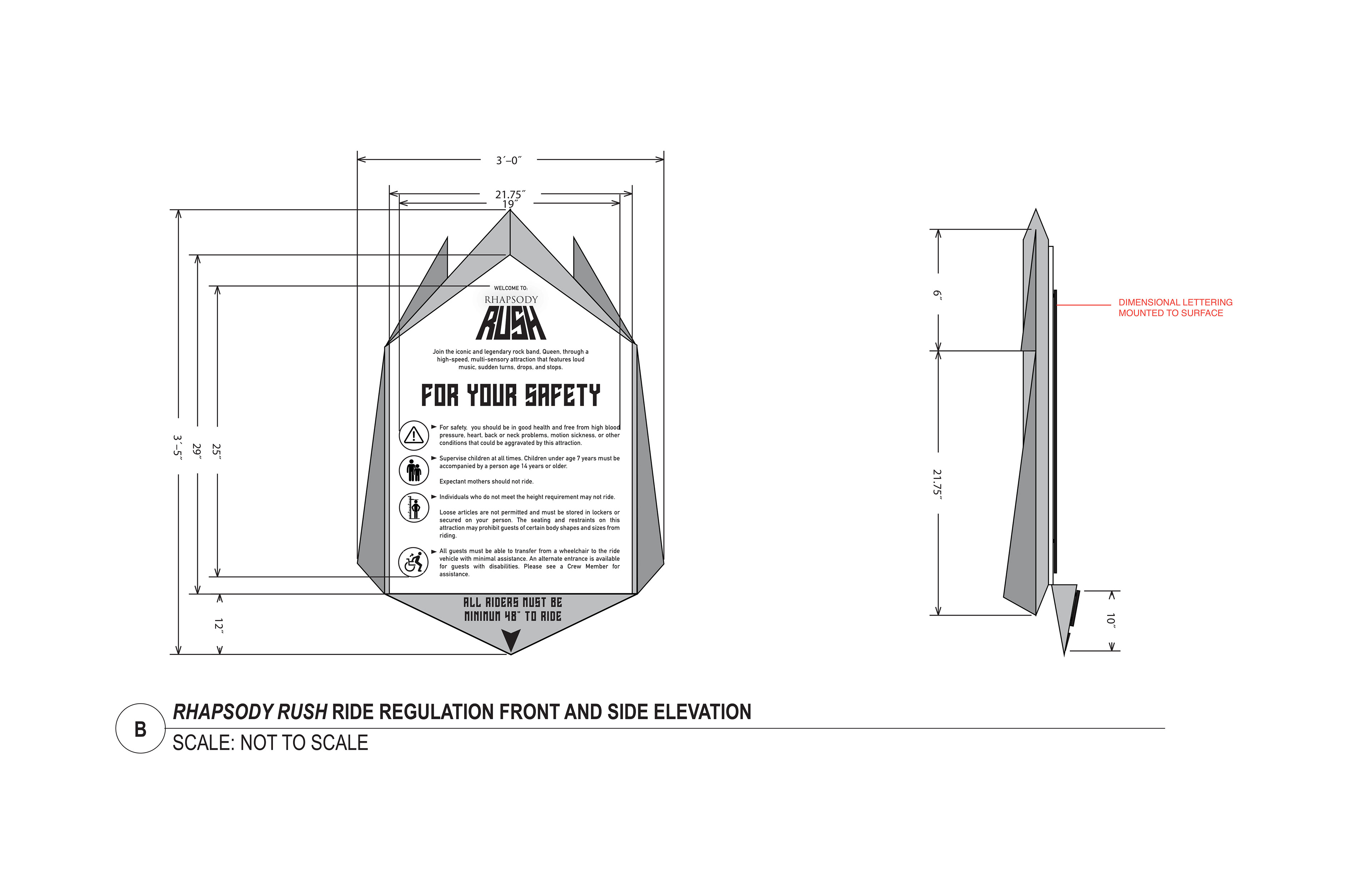
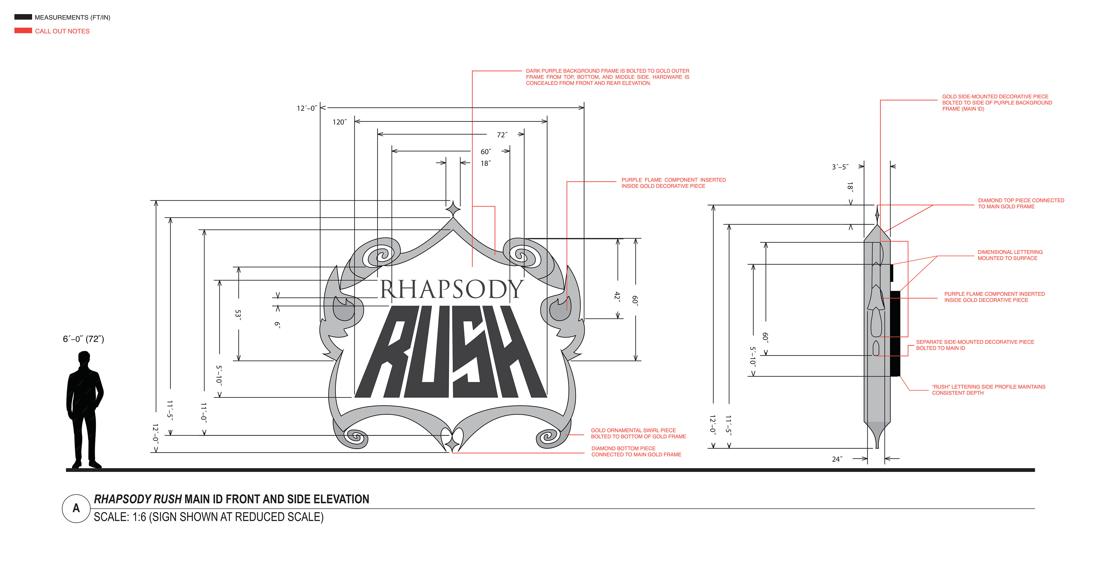
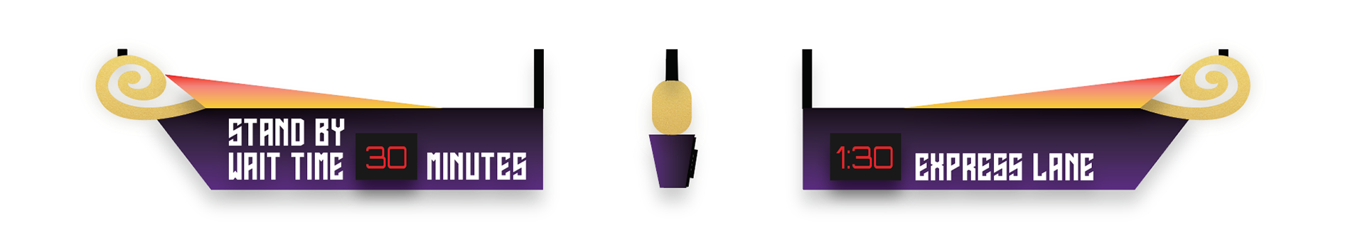
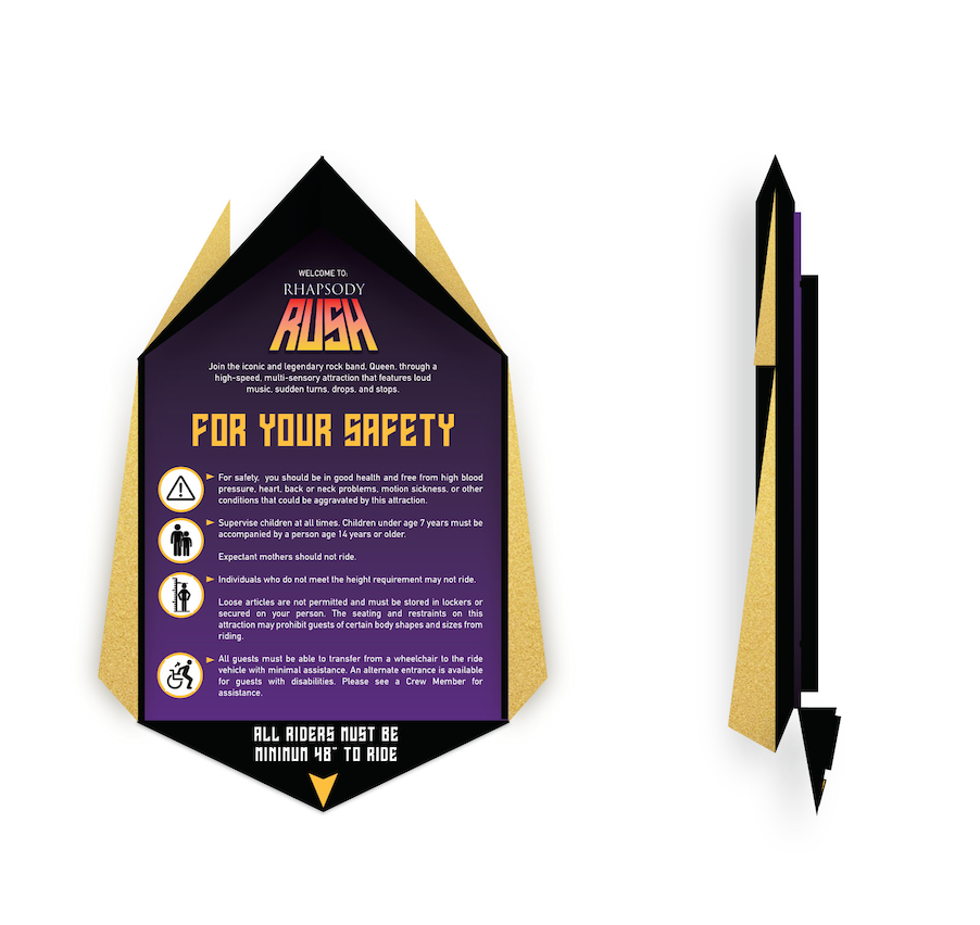
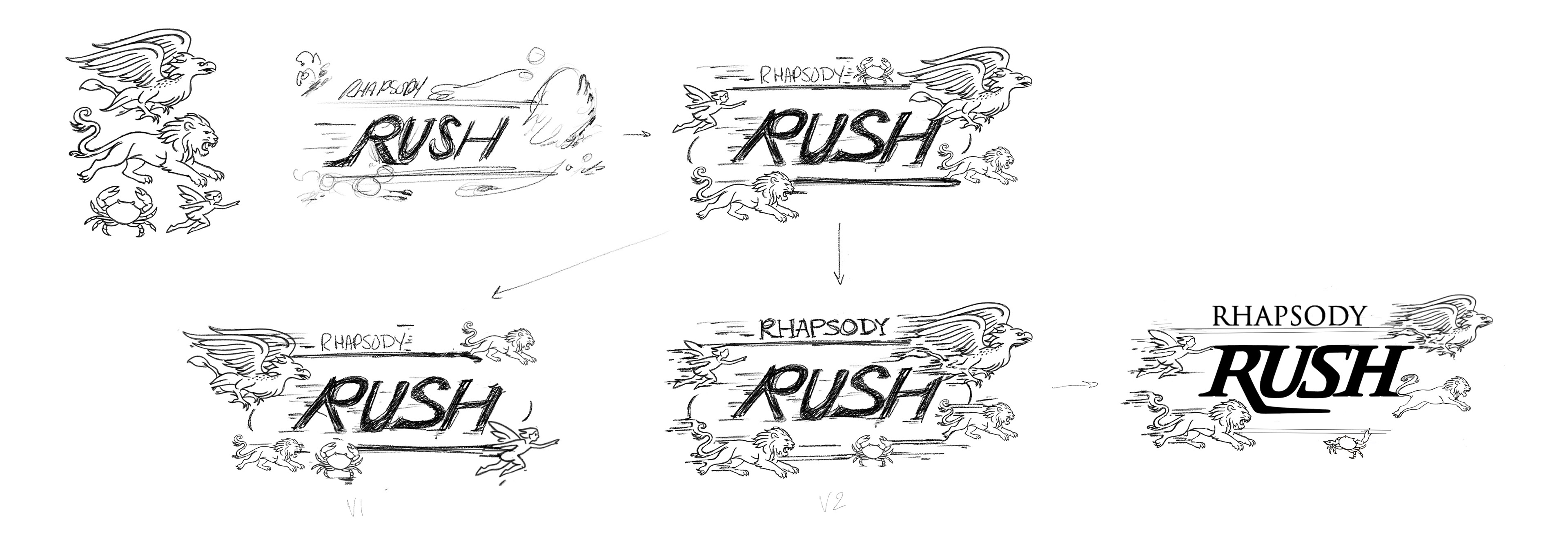
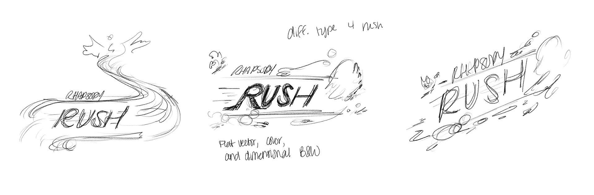
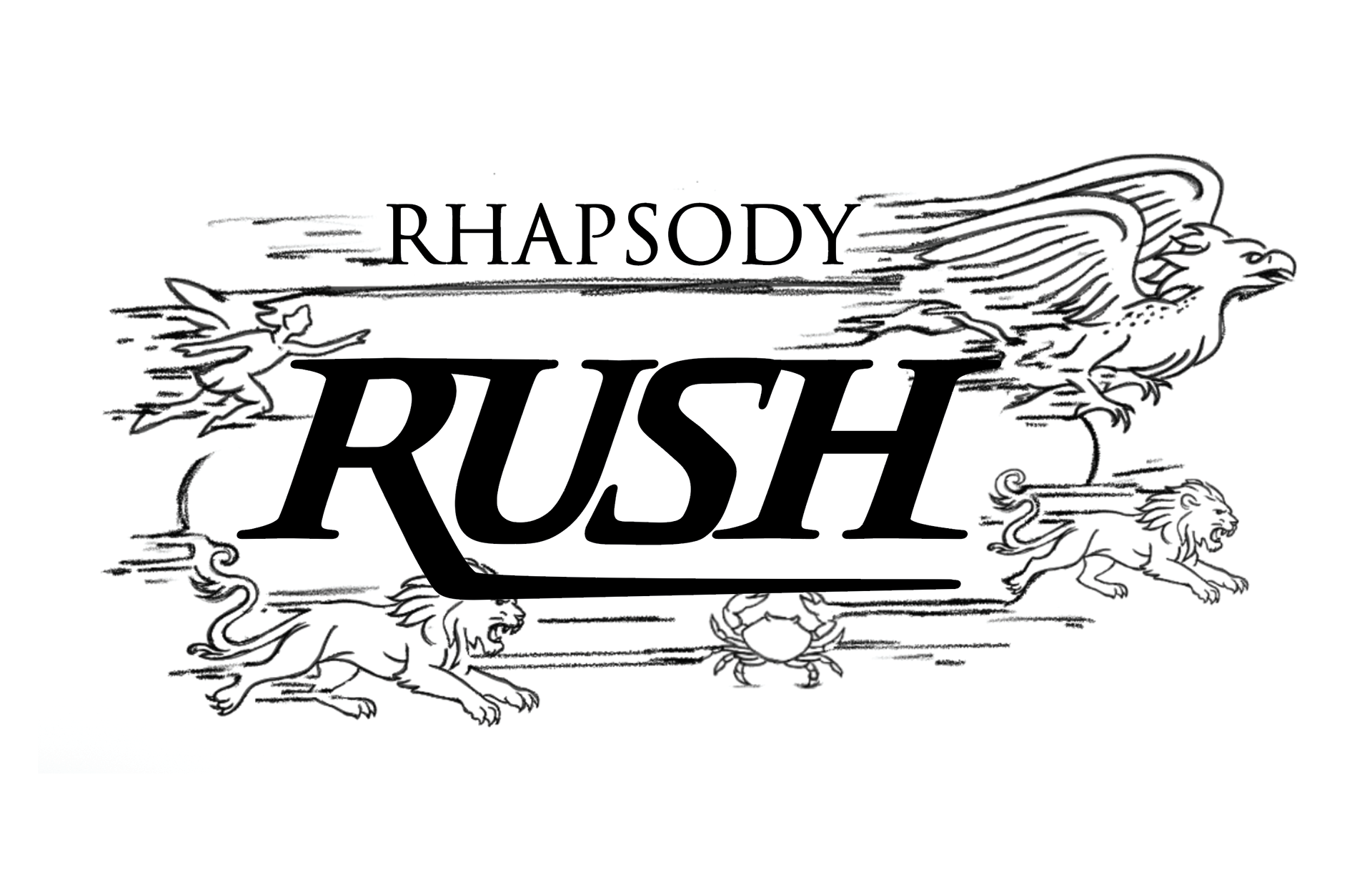
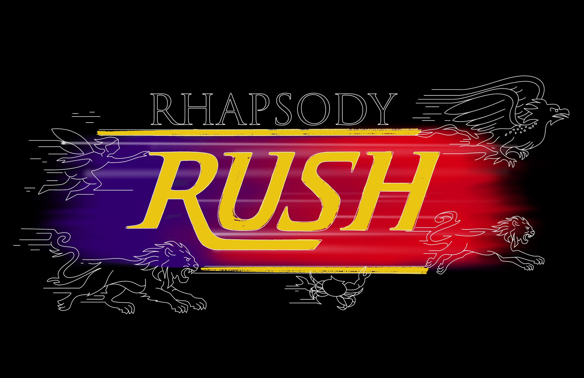
DESIGN B - EARLY CONCEPT
For Design B, I explored a bold, glam, opera design style for my signage, which was inspired by the theatrical and dramatic aspects of Queen's music. I thought this direction would capture the essence of their exciting energy. However, as I developed it further, I realized that the design wasn't immediately recognizable as Queen. It lacked the clear visual cues that would instantly connect it to the band, which could then create confusion for guests. So, I decided it needed a new approach, which ultimately led to the creation of Design A.
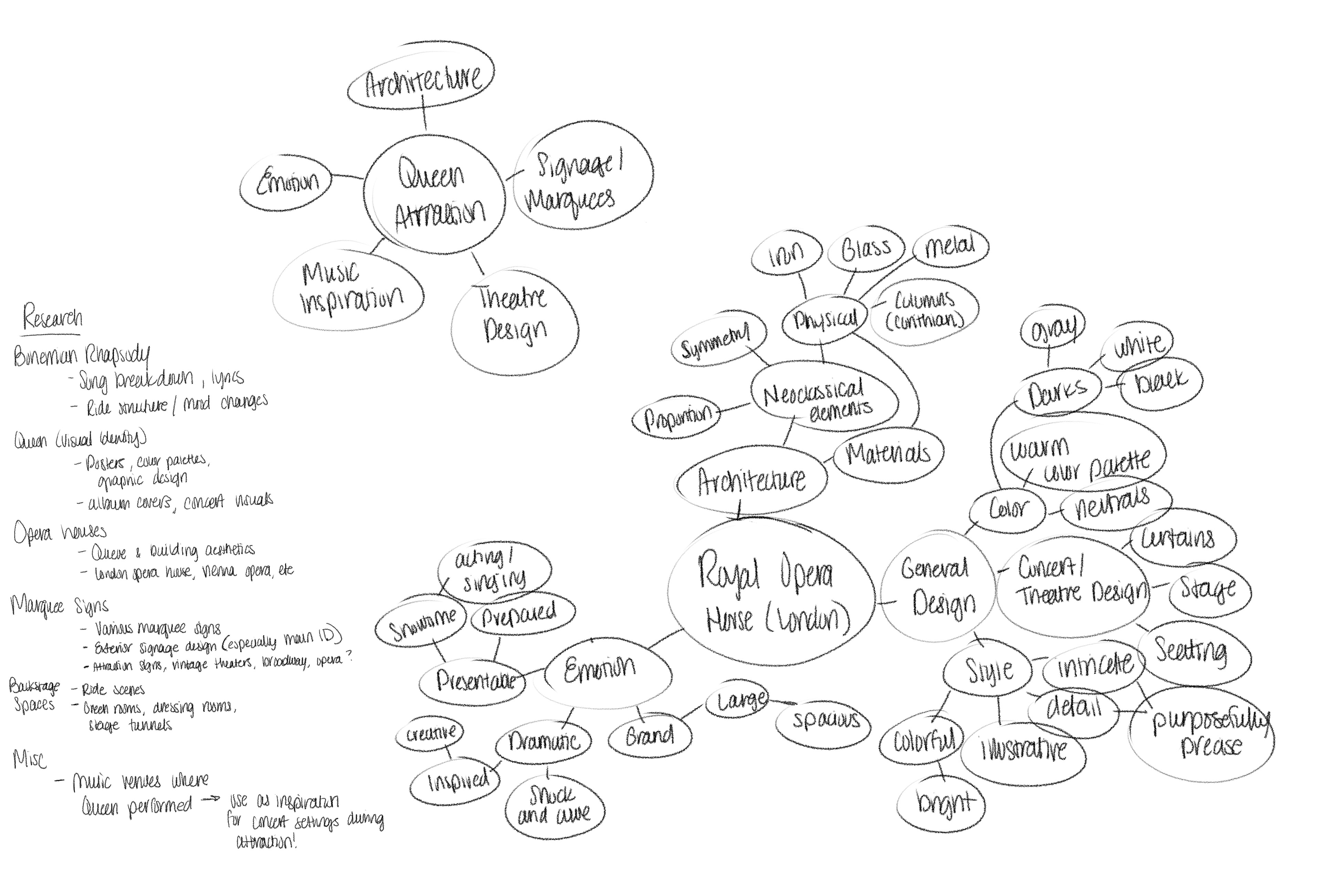
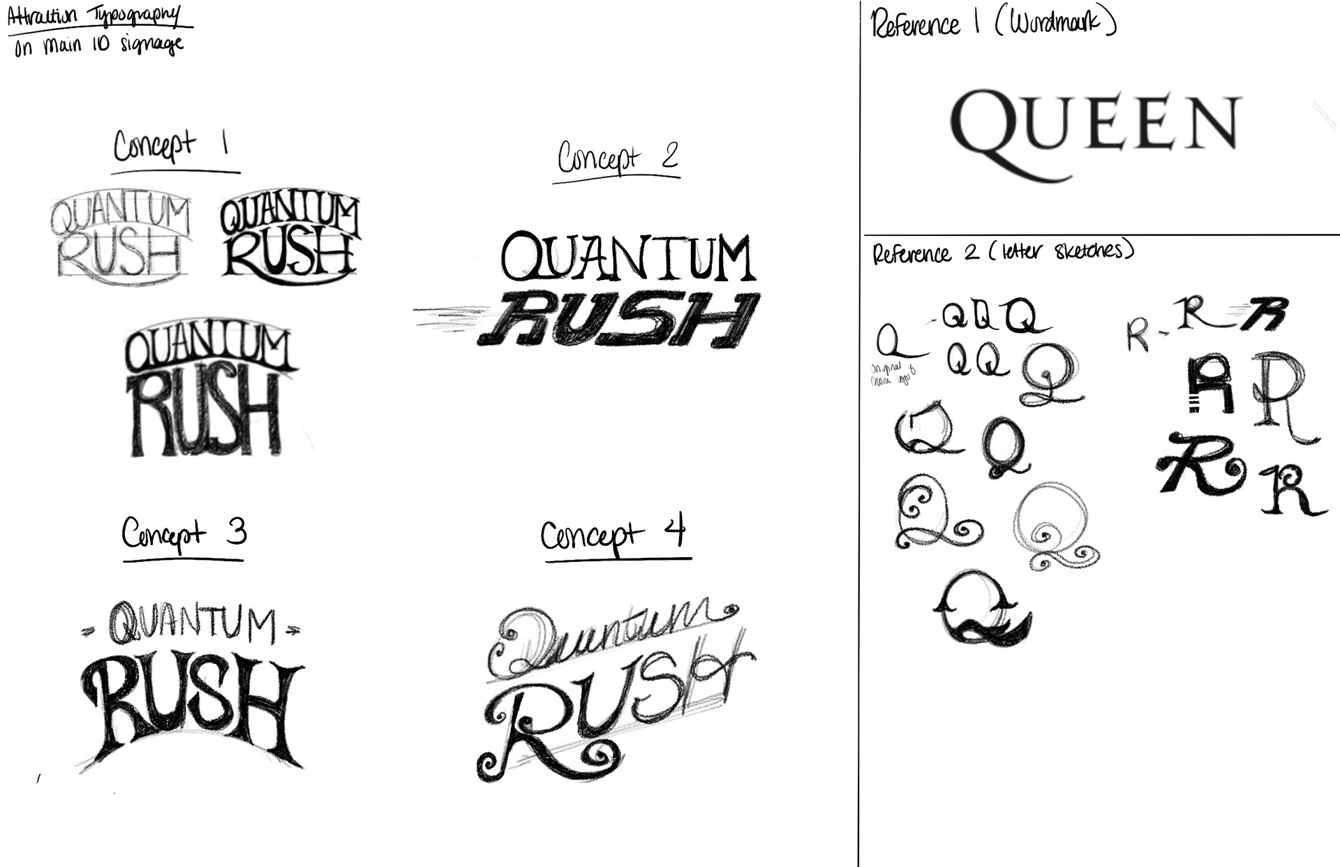
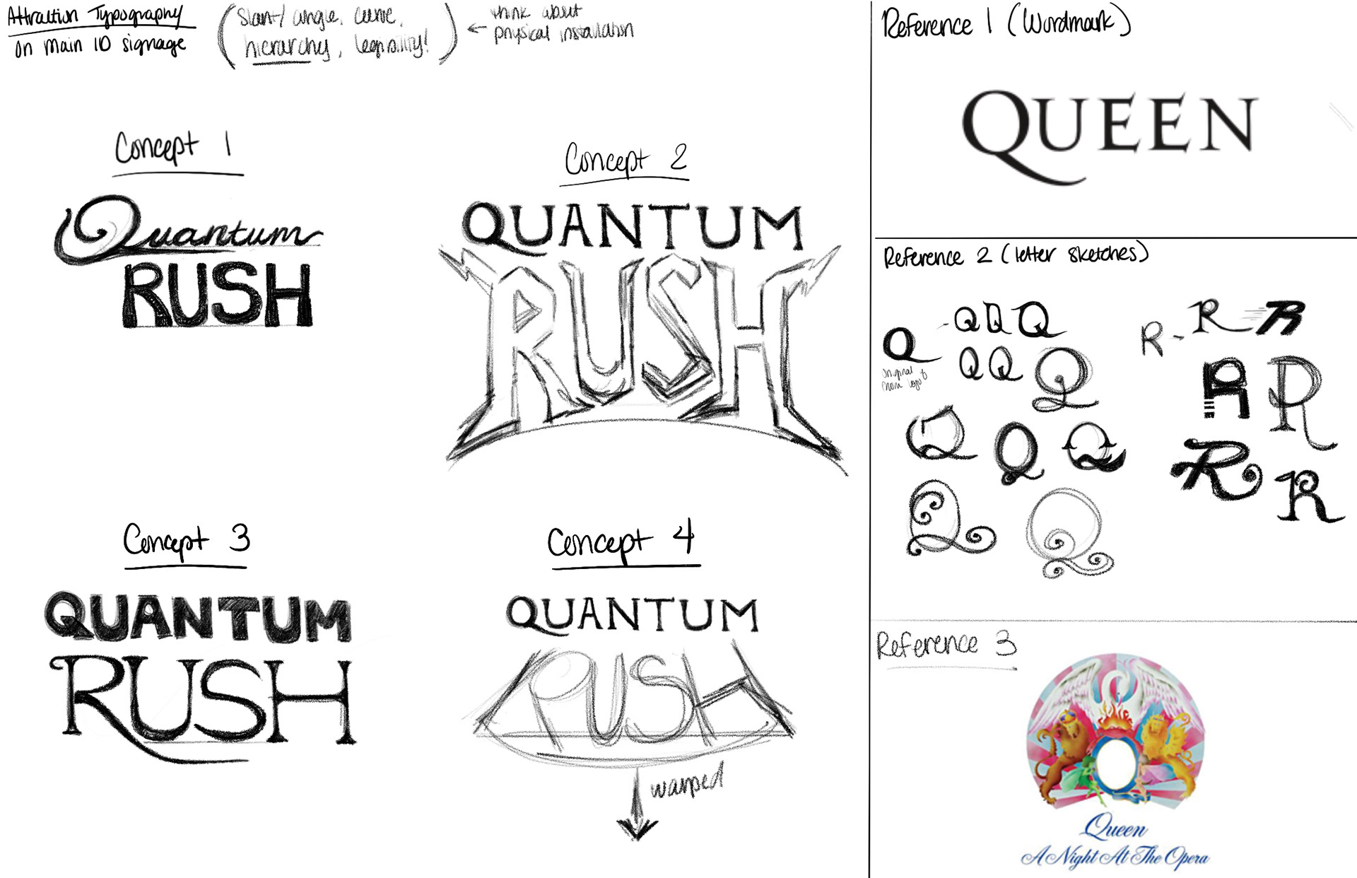
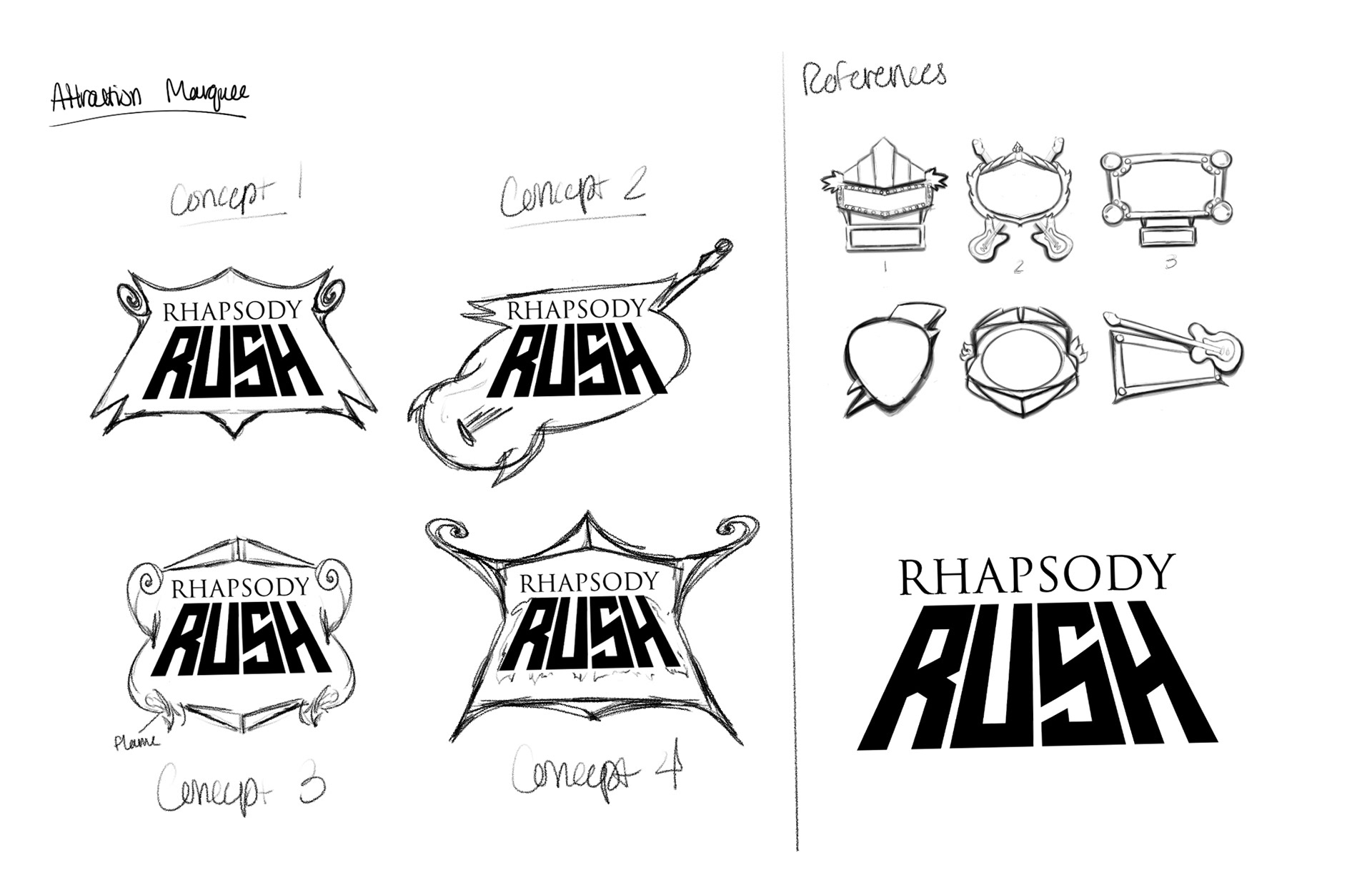
INITIAL IDEAS AND RESEARCH
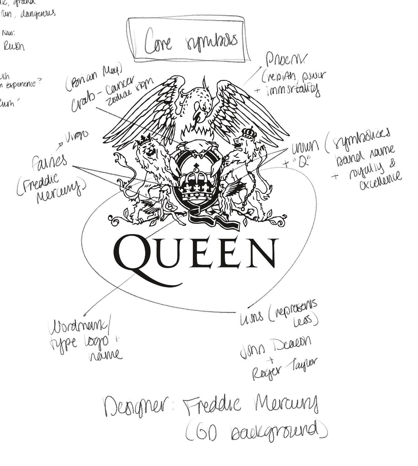
VISUAL LOGO BREAKDOWN